
Normality analysis.

There are three possible strategies to verify that a variable follows a normal distribution: methods based on hypothesis testing, those based on graphical representations and the so-called analytical methods.
When we think about mathematics, in general, and statistics, in particular, we tend to imagine a sea of extremely complicated numbers and formulas.
When we try to describe the relationship between two variables, we can use hundreds of words to convey a concept. But many of these times, we can save ink and time resorting to rendering a single formula.
Statistical formulas have their beauty, it cannot be denied. All full of uppercase and lowercase Greek letters, letters with hay or slash, and lots of subscripts and superscripts. In many cases, a glance at the formula will be enough to explain a concept that would require several lines of text in plain language.
However, there are times when the information can be so complex that it is not helpful to have only the formula that describes the situation. On these occasions, the popular saying that goes that a picture is worth a thousand words applies. We are talking about the graphical representation of the data.
By representing the data graphically, we can understand more quickly, easily and intuitively how the different variables evolve and are related. We see them daily in the media to represent the evolution of prices, unemployment, the spreading of a disease, etc.
And precisely about that, among other things, we are going to talk in today’s post, about how to use graphical methods to help us determine if our data follow a normal distribution since, as we will see, numerical methods can be unreliable.
The problem’s approach
We already know the normal distribution and its central role to be able to use parametric tests in hypothesis contrasts. For most of them, it is necessary to check that our data follow a normal distribution before choosing the technique to use.
Contrasts or normality analysis try to check how much the distribution of our data (those observed in our sample) differs from what we should expect if the data came from a population in which the variable followed a normal distribution with the same mean and standard deviation than that observed in the sample data.
For this check we have three possible strategies: methods based on hypothesis testing, those based on graphical representations and the so-called analytical methods.
Normality analysis using hypothesis tests
There are various techniques for hypothesis contrast to test whether or not a random variable follows a normal distribution.
As they are test for hypothesis contrast, they all provide a p-value that represents the probability of finding a distribution of the data like ours, or even further from normal, under the assumption of the null hypothesis that, in the population , the variable follows a perfect normal distribution.
In other words, for these tests the null hypothesis assumes normality. Therefore, if p> 0.05, we will have no reason to reject the null hypothesis and we will assume that our variable follows a normal distribution. If, on the contrary, p <0.05, we will reject the null hypothesis and assume that our variable does not follow a normal distribution in the population.
Hypothesis testing for normality analysis
There are, as we have already said, various tests to perform the normality analysis. Let’s see three of the most used.
When the sample size is not very large (in general, n <50) the most widely used is the Shapiro-Wilk test. It is quite simple to do with any statistical program. If we use R, the command is shapiro.test(x), where x is the vector with the data of the variable under study.
Another widely used normality analysis test is the Kolmogorov-Smirnov test. This test has the advantage that it allows us to study whether a sample comes from a population with a probability distribution with a determined mean and standard deviation, but it does not necessarily have to be a normal distribution.
The command in R to perform this test is ks(x, "pnorm", mean(x), standard deviation(x)).
The inconvenient of the Kolmogorov-Smirnov test is that it requires knowing the population mean and variance, unknown values in most situations.
To avoid this drawback, a modification of the test was developed, known as the Lilliefors test, whose command in R is lillie.test(x).
The Lilliefors test, which is fully designed for the analysis of normality, assumes that the variance and the population mean are unknown, therefore it constitutes the alternative to the Shapiro-Wilk test when the sample size is greater than 50.
The problem with contrast tests
The problem with these simple tests is that their results must always be interpreted with caution.
On the one hand, they are unpowered tests when the sample size is small. Based on the null hypothesis of normality, we may not reach statistical significance due to lack of statistical power, erroneously assuming that the data follow a normal distribution (as the null hypothesis cannot be rejected).
On the other hand, when the sample is very large, the opposite occurs: a small deviation from normality will suffice for the test to give us a significant p and reject the null hypothesis, when most parametric techniques would tolerate small deviations from normal if the sample is large.
For these reasons, it is advisable to always complete the normality analysis with a graphical method and not be left alone with the numerical method of hypothesis testing.
Normality analysis using graphical methods
In this case, a picture is worth a thousand words. Observing the graphical representation of the data, we can interpret whether its distribution is close enough to a normal one to assume that the variable follows that distribution in the population or if, on the contrary, it deviates from the normal distribution, no matter the results of hypotehsis contrast techniques.
The three most commonly used charts are the histogram, the box plot, and the quantile comparison plot.
Histogram
As we already know, the histogram represents the frequency distribution of the random variable under study.
The shape and distribution of the bars will help us to interpret whether the values are normally distributed. To help us further, the density curve of what would be a perfect normal distribution with a mean and standard deviation equal to that of our data is usually superimposed.
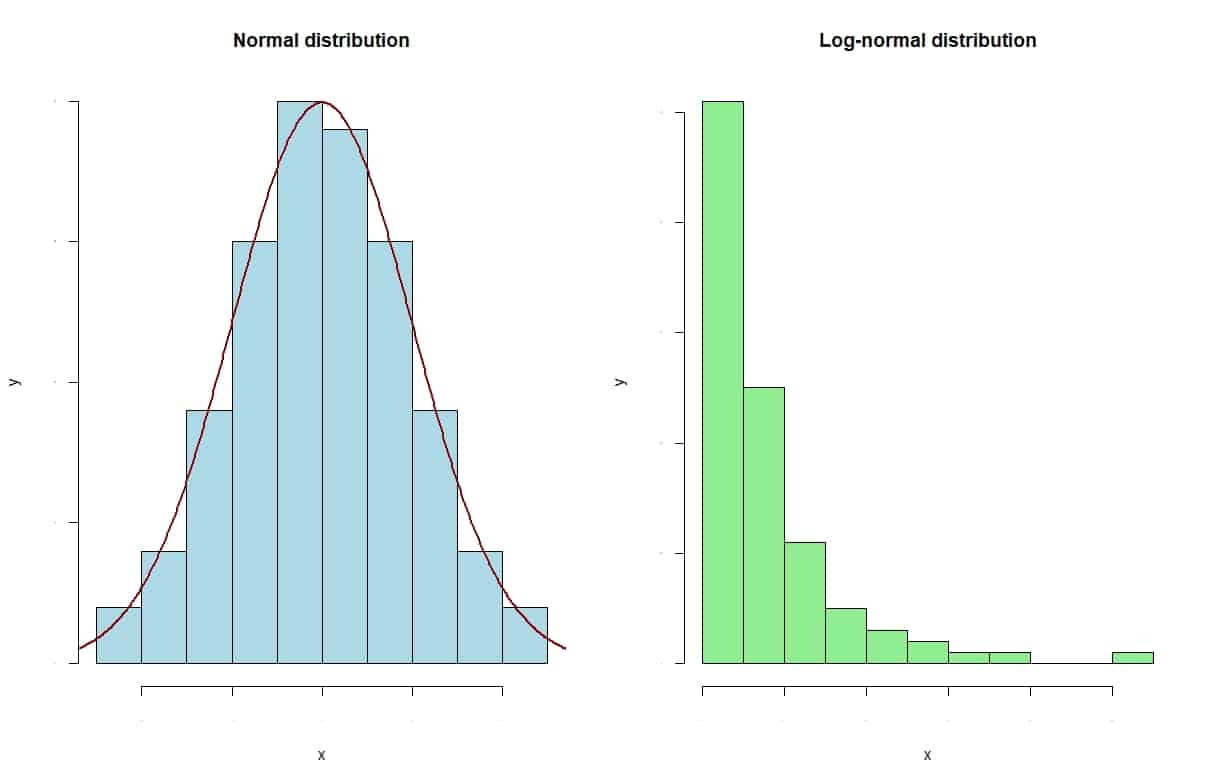
In the previous figure, you can see the histograms of two variables. The one on the left follows a normal distribution. You can see how the bars are distributed symmetrically with respect to the mean value. In addition, the profile of the bars matches the normal curve.
On the other hand, the one on the right follows a log-normal distribution. In this case, we see how the distribution is clearly asymmetric, with a long tail to the right. Looking at this graph, we would not hesitate: we would assume the normality of the distribution on the left and reject it in the case of the right.
Box plot
The box plot is used very frequently in statistics for its descriptive capabilities.
In the attached figure you can see the box diagrams of the two distributions whose histograms we saw above.
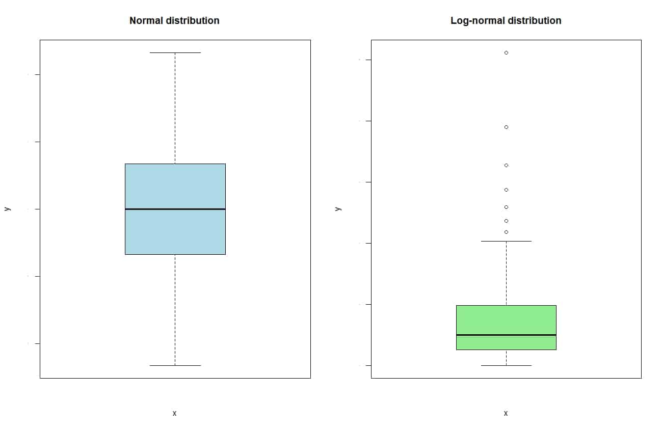
If we look at each box, the lower edge represents the 25th percentile of the distribution or, in other words, the first quartile. For its part, the upper border represents the 75th percentile of the distribution or, in other words, the third quartile.
In this way, the width of the box corresponds to the distance between the 25th and 75th percentiles, which is none other than the range or interquartile range. Finally, inside the box there is a line that represents the median (or second quartile) of the distribution.
Regarding the “whiskers” of the box, the upper one extends up to the maximum value of the distribution, but cannot go beyond 1.5 times the interquartile range. If there are more extreme values, they are represented as points beyond the end of the upper whisker.
And all this is true for the lower whisker, which extends to the minimum value, when there are no extreme values, or to the median minus 1.5 times the interquartile range when there are.
If you look at the graph, the normal distribution has a symmetric box around the mean, with both segments of the interquartile range of similar length.
For its part, the log-normal shows a clear asymmetry, with a longest upper segment of the interquartile range and with several extreme values beyond the upper whisker. It is the equivalent of the skewness with the right bias that we observed in the histogram.
Quantile comparison graph
The quantile comparison graph, also known by its nickname, qqplot, represents the quantiles of our distribution against the theoretical quantiles that it would have if it followed a normal distribution with the same mean and standard distribution as our data.
If the data follows a normal distribution, it will line up close to the diagonal of the graph. The further they go appart, the less likely our data is to follow a normal distribution.
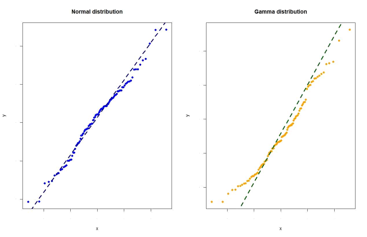
You can look at the attached figure, which represents the graph of quantiles of a normal distribution and a gamma distribution.
You can see that the points line up reasonably rectilinear with the diagonal in the case of the normal distribution, while the points of the gamma form an S-shaped line that departs from the diagonal.
We’re leaving…
And with this we are going to leave it for today.
We have seen the main hypothesis testing methods for normality analysis and how they should always be complemented with some graphic method. What we have not talked about at all is analytical methods. These are based on the analysis of two of the moments of the normal distribution, skewness and kurtosis. But that is another story…