Publication bias.

We describe publication bias in meta-analysis and the most used methods that are empoyed for its study, both graphical and numerical.
Achilles. What a man! Definitely, one of the main characters among those who were in that mess that was ensued in Troy because of Helena, a.k.a. the beauty. You know his story. In order to make him invulnerable his mother, who was none other than Tetis, the nymph, bathed him in ambrosia and submerged him in the River Stix. But she made a mistake that should not have been allowed to any nymph: she took him by his right heel, which did not get wet with the river’s water. And so, his heel became his only vulnerable part. Hector didn’t realize it in time but Paris, totally on the ball, put an arrow in Achilles’ heel and sent him back to the Stix, but not into the water, but rather to the other side. And without Charon the Ferryman.
This story is the origin of the expression “Achilles’ heel”, which usually refers to the weakest or most vulnerable point of someone or something that, otherwise, is usually known for its strength.
Publication bias
For example, something as robust and formidable as meta-analysis has its Achilles heel: the publication bias. And that’s because in the world of science there is no social justice.
All scientific works should have the same opportunities to be published and achieve fame, but the reality is not at all like that and they can be discriminated against for four reasons: statistical significance, popularity of the topic they are dealing with, having someone to sponsor them and the language in which they are written.
These are the main factors that can contribute to publication bias. First, studies with more significant results are more likely to be published and, within these, they are more likely to be published when the effect is greater. This means that studies with negative results or effects of small magnitude may not be published, which will draw a biased conclusion from the analysis only of large studies with positive results. In the same way, papers on topics of public interest are more likely to be published regardless of the importance of their results. In addition, the sponsor also influences: a company that finances a study with a product of theirs that has gone wrong, probably is not going to publish it so that we all know that their product is not useful.
Secondly, as is logical, published studies are more likely to reach our hands than those that are not published in scientific journals. This is the case of doctoral theses, communications to congresses, reports from government agencies or, even, pending studies to be published by researchers of the subject that we are dealing with. For this reason it is so important to do a search that includes this type of work, which is included within the grey literature term.
Finally, a series of biases can be listed that influence the likelihood that a work will be published or retrieved by the researcher performing the systematic review such as language bias (the search is limited by language), availability bias ( include only those studies that are easy for the researcher to recover), the cost bias (studies that are free or cheap), the familiarity bias (only those from the researcher’s discipline are included), the duplication bias (those that have significant results are more likely to be published more than once) and citation bias (studies with significant results are more likely to be cited by other authors).
One may think that this loss of studies during the review cannot be so serious, since it could be argued, for example, that studies not published in peer-reviewed journals are usually of poorer quality, so they do not deserve to be included in the meta-analysis However, it is not clear either that scientific journals ensure the methodological quality of the study or that this is the only method to do so. There are researchers, like those of government agencies, who are not interested in publishing in scientific journals, but in preparing reports for those who commission them. In addition, peer review is not a guarantee of quality since, too often, neither the researcher who carries out the study nor those in charge of reviewing it have a training in methodology that ensures the quality of the final product.
All this can be worsened by the fact that these same factors can influence the inclusion and exclusion criteria of the meta-analysis primary studies, in such a way that we obtain a sample of articles that may not be representative of the global knowledge on the subject of the systematic review and meta-analysis.
If we have a publication bias, the applicability of the results will be seriously compromised. That is why we say that the publication bias is the true Achilles’ heel of meta-analysis.
If we correctly delimit the inclusion and exclusion criteria of the studies and do a global and unrestricted search of the literature we will have done everything possible to minimize the risk of bias, but we can never be sure of having avoided it. That is why techniques and tools have been devised for its detection.
Publication bias study
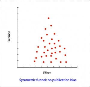 The most used has the sympathetic name of funnel plot. It shows the magnitude of the measured effect (X axis) versus a precision measurement (Y axis), which is usually the sample size, but which can also be the inverse of the variance or the standard error. We represent each primary study with a point and observe the point cloud.
In the most usual way, with the size of the sample on the Y axis, the precision of the results will be higher in the larger sample studies, so that the points will be closer together in the upper part of the axis and will be dispersed when approaching the origin of the axis Y. In this way, we observe a cloud of points in the form of a funnel, with the wide part down. This graphic should be symmetrical and, if that is not the case, we should always suspect a publication bias. In the second example attached you can see how there are “missing” studies on the side of lack of effect: this may mean that only studies with positive results are published.
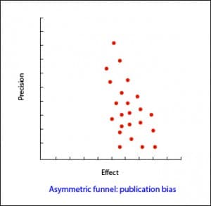 This method is very simple to use but, sometimes, we can have doubts about the asymmetry of our funnel, especially if the number of studies is small. In addition, the funnel can be asymmetrical due to quality defects in the studies or because we are dealing with interventions whose effect varies according to the sample size of each study. For these cases, other more objective methods have been devised, such as the Begg’s rank correlation test and the Egger’s linear regression test.
The Begg’s test studies the presence of association between the estimates of the effects and their variances. If there is a correlation between them, bad going. The problem with this test is that it has little statistical power, so it is not reliable when the number of primary studies is small.
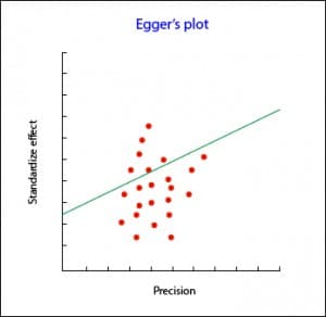 Egger’s test, more specific than Begg’s, consists of plotting the regression line between the precision of the studies (independent variable) and the standardized effect (dependent variable). This regression must be weighted by the inverse of the variance, so I do not recommend that you do it on your own, unless you are consummate statisticians. When there is no publication bias, the regression line originates at the zero of the Y axis. The further away from zero, the more evidence of publication bias.
As always, there are computer programs that do these tests quickly without having to burn your brain with the calculations.
What if after doing the work we see that there is publication bias? Can we do something to adjust it? As always, we can.
The simplest way is to use a graphic method called trim and fill. It consists of the following: a) we draw the funnel plot; b) we remove the small studies so that the funnel is symmetrical; c) the new center of the graph is determined; d) we recover the previously removed studies and we add their reflection to the other side of the center line; e) we estimate again the effect.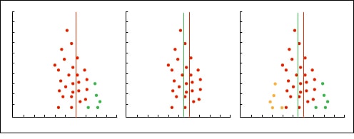
Other methods of studying publication bias
Another very conservative attitude that we can adopt is to assume that there is a publication bias and to ask how much it affects our results, assuming that we have left studies not included in the analysis.
The only way to know if the publication bias affects our estimates would be to compare the effect in the retrieved and unrecovered studies but, of course, then we would not have to worry about the publication bias.
To know if the observed result is robust or, on the contrary, it is susceptible to be biased by a publication bias, two methods of the fail-safe N have been devised.
The first is the Rosenthal’s fail-safe N method. Suppose we have a meta-analysis with an effect that is statistically significant, for example, a risk ratio greater than one with a p <0.05 (or a 95% confidence interval that does not include the null value, one). Then we ask ourselves a question: how many studies with RR = 1 (null value) will we have to include until p is not significant? If we need few studies (less than 10) to make the value of the effect null, we can worry because the effect may in fact be null and our significance is the product of a publication bias. On the contrary, if many studies are needed, the effect is likely to be truly significant. This number of studies is what the letter N of the name of the method means.
The problem with this method is that it focuses on the statistical significance and not on the relevance of the results. The correct thing would be to look for how many studies are needed so that the result loses clinical relevance, not statistical significance. In addition, it assumes that the effects of the missing studies is null (one in case of risk ratios and odds ratios, zero in cases of differences in means), when the effect of the missing studies can go in the opposite direction than the effect that we detect or in the same sense but of smaller magnitude.
To avoid these disadvantages there is a variation of the previous formula that assesses the statistical significance and clinical relevance. With this method, which is called the Orwin’s fail-safe N, it is calculated how many studies are needed to bring the value of the effect to a specific value, which will generally be the least effect that is clinically relevant. This method also allows to specify the average effect of the missing studies.
The PRISMA statement
To end the meta-analysis explanation, let’s see what is the right way to express the results of data analysis. To do it well, we can follow the recommendations of the PRISMA statement, which devotes seven of its 27 items to give us advice on how to present the results of a meta-analysis.
First, we must inform about the selection process of studies: how many we have found and evaluated, how many we have selected and how many rejected, explaining in addition the reasons for doing so. For this, the flowchart that should include the systematic review from which the meta-analysis proceeds if it complies with the PRISMA statement is very useful.
Secondly, the characteristics of the primary studies must be specified, detailing what data we get from each one of them and their corresponding bibliographic citations to facilitate that any reader of the review can verify the data if he does not trust us. In this sense, there is also the third section, which refers to the evaluation of the risk of study biases and their internal validity.
Fourth, we must present the results of each individual study with a summary data of each intervention group analyzed together with the calculated estimators and their confidence intervals. These data will help us to compile the information that PRISMA asks us in its fifth point referring to the presentation of results and it is none other than the synthesis of all the meta-analysis studies, their confidence intervals, homogeneity study results, etc.
This is usually done graphically by means of an effects diagram, a graphical tool popularly known as forest plot, where the trees would be the primary studies of the meta-analysis and where all the relevant results of the quantitative synthesis are summarized.
The Cochrane’s Collaboration recommends structuring the forest plot in five well differentiated columns. Column 1 lists the primary studies or the groups or subgroups of patients included in the meta-analysis. They are usually represented by an identifier composed of the name of the first author and the date of publication.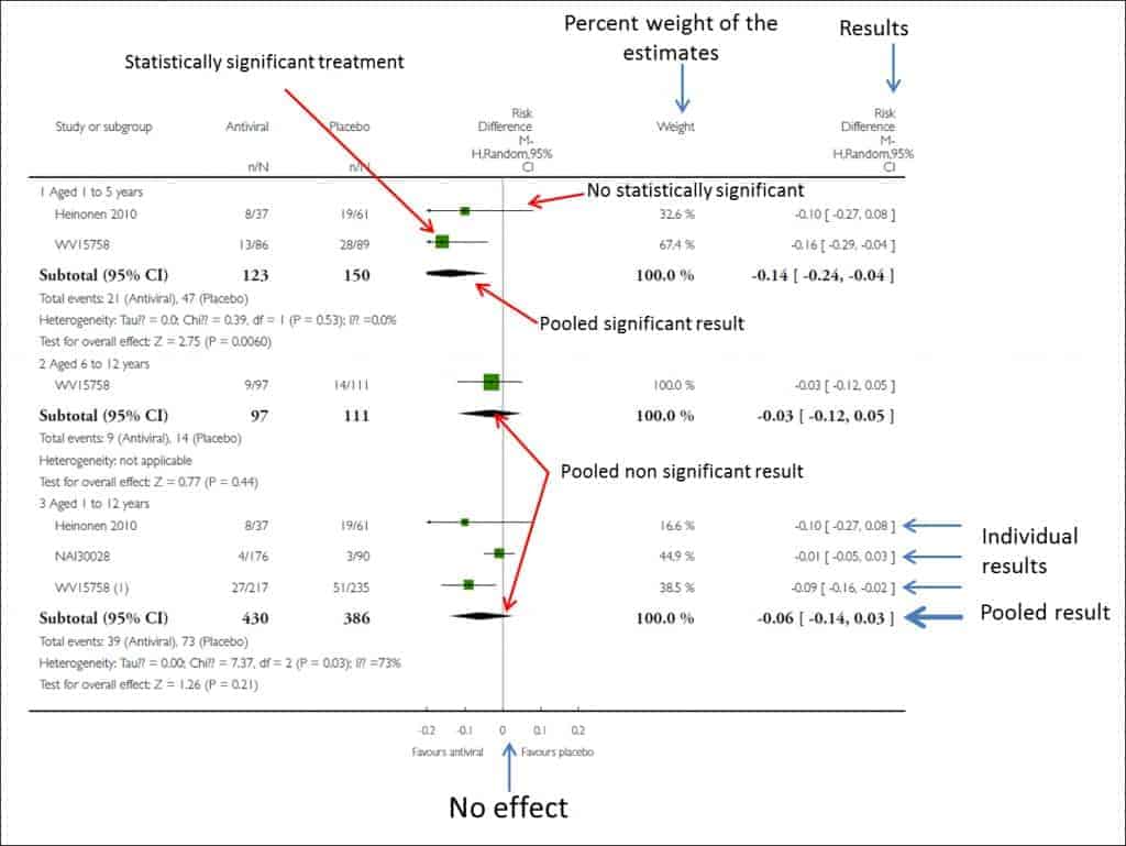 Column 2 shows the results of the measures of effect of each study as reported by their respective authors.
Column 3 is the actual forest plot, the graphic part of the subject. It shows the measures of effect of each study on both sides of the zero effect line, which we already know is zero for mean differences and one for odds ratios, risk ratios, hazard ratios, etc. Each study is represented by a square whose area is usually proportional to the contribution of each one to the overall result. In addition, the square is within a segment that represents the extremes of its confidence interval.
These confidence intervals inform us about the accuracy of the studies and tell us which are statistically significant: those whose interval does not cross the zero effect line. Anyway, do not forget that, although crossing the line of no effect and being not statistically significant, the interval boundaries can give us much information about the clinical significance of the results of each study. Finally, at the bottom of the chart we will find a diamond that represents the global result of the meta-analysis. Its position with respect to the null effect line will inform us about the statistical significance of the overall result, while its width will give us an idea of its accuracy (its confidence interval). Furthermore, on top of this column will find the type of effect measurement, the analysis model data is used (fixed or random) and the significance value of the confidence intervals (typically 95%).
This chart is usually completed by a fourth column with the estimated weight of each study in per cent format and a fifth column with the estimates of the weighted effect of each. And in some corner of this forest will be the measure of heterogeneity that has been used, along with its statistical significance in cases where relevant.
To conclude the presentation of the results, PRISMA recommends a sixth section with the evaluation that has been made of the risks of bias in the study and a seventh with all the additional analyzes that have been necessary: stratification, sensitivity analysis, metaregression, etc.
What the Cochrane says
As you can see, nothing is easy about meta-analysis. Therefore, the Cochrane’s recommends following a series of steps to correctly interpret the results. Namely:
- Verify which variable is compared and how. It is usually seen at the top of the forest plot.
- Locate the measure of effect used. This is logical and necessary to know how to interpret the results. A hazard ratio is not the same as a difference in means or whatever it was used.
- Locate the diamond, its position and its amplitude. It is also convenient to look at the numerical value of the global estimator and its confidence interval.
- Check that heterogeneity has been studied. This can be seen by looking at whether the segments that represent the primary studies are or are not very dispersed and whether they overlap or not. In any case, there will always be a statistic that assesses the degree of heterogeneity. If we see that there is heterogeneity, the next thing will be to find out what explanation the authors give about its existence.
- Draw our conclusions. We will look at which side of the null effect line are the overall effect and its confidence interval. You already know that, although it is significant, the lower limit of the interval should be as far as possible from the line, because of the clinical relevance, which does not always coincide with statistical significance. Finally, look again at the study of homogeneity. If there is a lot of heterogeneity, the results will not be as reliable.
We’re leaving…
And with this we end the topic of meta-analysis. In fact, the forest plot is not exclusive to meta-analyzes and can be used whenever we want to compare studies to elucidate their statistical or clinical significance, or in cases such as equivalence studies, in which the null effect line is joined of the equivalence thresholds. But it still has one more utility. A variant of the forest plot also serves to assess if there is a publication bias in the systematic review, although, as we already know, in these cases we change its name to funnel graph. But that is another story…
