Graphical representation of qualitative variables.

Two of the most used graphs for qualitative variables are described: the pie chart and the bar chart. Pareto’s graph is also mentioned.
When you read the title of this post, you can ask yourself with what stupid occurrence am I going to crush the suffered concurrence today, but do not fear, all we are going to do is to put in prospective value that famous aphorism that says that a picture is worth a thousand words. Have I clarified something? I suppose not.
As we all know, descriptive statistics is that branch of statistics that we usually use to obtain a first approximation to the results of our study, once we have finished it.
The first thing we do is to describe the data, for which we make frequency tables and use various measures of tendency and dispersion. The problem with these parameters is that, although they truly represent the essence of the data, it is sometimes difficult to provide a synthetic and comprehensive view with them. It is in these cases that we can resort to another resource, which is none other than the graphic representation of the study results. You know, a picture is worth a thousand words, or so they say.
There are many types of graphs to help us better understand the data, but today we are only going to talk about those that have to do with qualitative or categorical variables.
Remember that qualitative variables represent attributes or categories of the variable. When the variable does not include any sense of order, it is said to be a nominal categorical variable, while if a certain order can be established between the categories, we would say that it is an ordinal categorical variable. For example, the variable “smoker” would be nominal if it has two possibilities: “yes” or “no”. However, if we define it as “occasional”, “little smoker”, “moderate” or “heavy smoker”, there is already a certain hierarchy and we speak of ordinal qualitative variable.
Graphical representation of qualitative variables
The first type of chart that we are going to consider when representing a qualitative variable is the pie chart. This consists of a circle whose area represents the total data. Thus, an area that will be directly proportional to its frequency is assigned to each category. In this way, the most frequent categories will have larger areas, so that we can get an idea of how the frequencies are distributed in the categories at a glance.
Pie chart
There are three ways to calculate the area of each sector. The simplest is to multiply the relative frequency of each category by 360 °, obtaining the degrees of that sector.
The second is to use the absolute frequency of the category, according to the following rule of three:
Absolute frequency / Total data frequency = Degrees of the sector / 360 °
Finally, the third way is to use the proportions or percentages of the categories:
% of the category / 100% = Degrees of the sector / 360 °

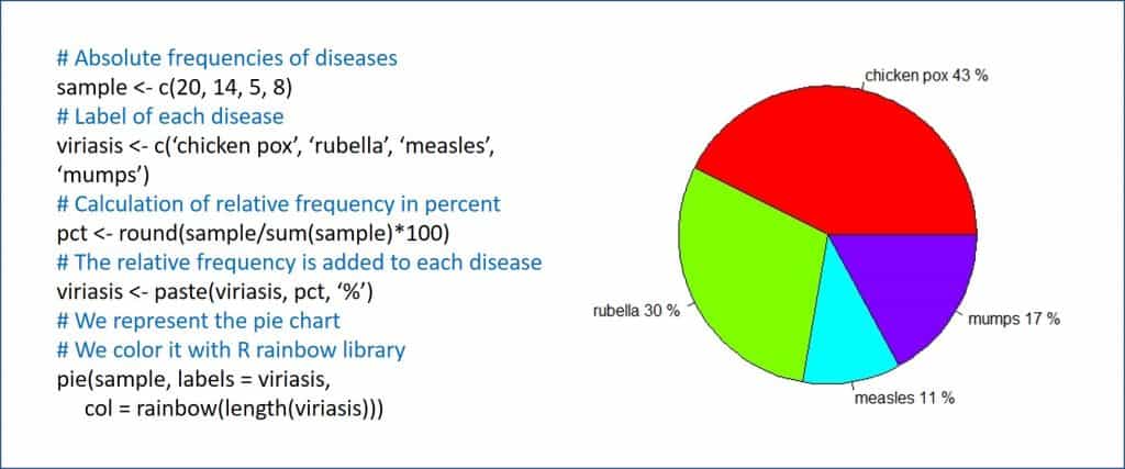
The formulas are very simple, but, in any case, there will be no need to resort to them because the program with which we make the graph will do it for us. The instruction in R is pie(), as you can see in the first figure, in which I show you a distribution of children with exanthematic diseases and how the pie chart would be represented.The pie chart is designed to represent nominal categorical variables, although it is not uncommon to see pies representing variables of other types. However, and in my humble opinion, this is not entirely correct.
For example, if we make a pie chart for an ordinal qualitative variable, we will be losing information about the hierarchy of the variables, so it would be more correct to use a chart that allows to sort the categories from less to more. And this chart is none other than the bar chart, which we’ll talk about next.
The pie chart will be especially useful when there are few categories of the variable. If there are many, the interpretation is no longer so intuitive, although we can always complete the graph with a frequency table that helps us to better interpret the data. Another tip is to be very careful with 3D effects when drawing cakes. If we go from elaborate, the graphic will lose clarity and will be more difficult to read.
Bar chart
The second graph that we are going to see is, as we have already mentioned, the bar chart, the optimum to represent ordinal qualitative variables. On the horizontal axis, the different categories are represented, and on it some columns or bars are raised whose height is proportional to the frequency of each category. We could also use this type of graph to represent discrete quantitative variables, but what is not very correct to do is use it for the qualitative nominal variables.
The bar chart is able to express the magnitude of the differences between the categories of the variable, but it is precisely its weak point, since it is easily manipulated if we modify the axes’ scales. That is why we must be careful when analyzing this type of graphics to avoid being deceived by the message that the author of the study may want to convey.

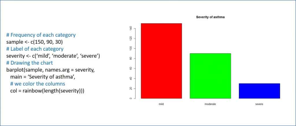
This chart is also easy to do with most statistical programs and spreadsheets. The function in R is barplot(), as you can see in the second figure, which represents a sample of asthmatic children classified by severity.
With what has been seen so far, some will think that the title of this post is a bit misleading. Actually, the thing is not about columns and sectors, but about bars and pies. Also, who is the illustrious Italian? Well, here I do not fool anyone, because the character was both Italian and illustrious, and I am referring to Vilfredo Federico Pareto.
Pareto’s chart
Pareto was an Italian who was born in the mid-19th century in Paris. This small contradiction is due to the fact that his father was then exiled in France for being one of the followers of Giuseppe Mazzini, who was then committed to Italian unification.
Anyway, Pareto lived in Italy from he was 10 years old on, becoming an engineer with extensive mathematical and humanistic knowledge and who contributed decisively to the development of microeconomics. He spoke and wrote fluently in French, English, Italian, Latin and Greek, and became famous for a multitude of contributions such as the Pareto’s distribution, Pareto’s efficiency, Pareto’s index and Pareto’s principle. To represent the latter, he invented the Pareto’s diagram, which is what brings him here today among us.


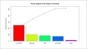
Pareto chart (also known in economics as a closed curve or A-B-C distribution) organizes the data in descending order from left to right, represented by bars, thus assigning an order of priorities. In addition, the diagram incorporates a curved line that represents the cumulative frequency of the categories of the variable. This initially allowed the Pareto’s principle to be explained, which goes on to say that there are many minor problems compared to a few that are important, which was very useful for decision-making.
As it is easy to understand, this prioritization makes the Pareto diagram especially useful for representing ordinal qualitative variables, surpassing the bar chart by giving information on the percentage accumulated by adding the categories of the distribution of the variable.
he change in slope of this curve also informs us of the change in the concentration of data, which depends on the variability in which the subjects of the sample are divided between the different categories.
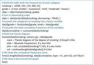
Unfortunately, R does not have a simple function to represent Pareto diagrams, but we can easily obtain it with the script that I attached in the third figure, obtaining the graph of the fourth.
We’re leaving…
And here we are going to leave it for today. Before saying goodbye, I want to warn you that you should not confuse the bars of the bar chart with those of the histogram since, although they can be similar from the graphic point of view, both represent very different things. In a bar chart only the values of the variables we have observed when doing the study are represented.
However, the histogram goes much further since, in reality, it contains the frequency distribution of the variable, so it represents all possible values that exist within the intervals, although we have not observed any directly. It allows us to calculate the probability that any distribution value will be represented, which is of great importance if we want to make inference and estimate population values based on the results of our sample. But that is another story…
