Influencers in meta-analysis.

Occasionally, among the primary studies in a meta-analysis, there may be some that, without estimating an excessively large or small effect, can have a significant influence on the overall estimate of the study, thus compromising its robustness. These are referred to as influential studies, or more commonly, influencers.
There are things in life I just can’t wrap my head around. For example, how did we end up in a world where someone filming themselves dabbing cream on their cheekbones can influence the buying habits of half the planet?
Because that’s exactly what modern influencers do, with their dazzling white teeth, their 27-step skincare routines, and health tips that would make Hippocrates weep. And as if shaping markets weren’t bad enough, the real calamity is that they also shape minds. And not in a good way. The most worrying part isn’t them… it’s their followers: hordes ready to chug celery juice on an empty stomach or slather on salmon sperm without asking a single question.
And you know what? The world of meta-analyses isn’t as far removed from this madness as you might think. There are influencers here too: studies that, without being the most extreme or bizarre, manage to bend the whole analysis around them. They’re not selling beauty hacks, but their effect on the pooled estimate or study heterogeneity is as disproportionate as a laminated eyebrow in 4K.
Plenty of researchers follow these studies like fans chasing an influencer, mesmerized by their apparent strength, without stopping to ask whether it’s solid evidence or just statistical sparkle. Today, we’re taking apart the diva that moves the effect, a study that, while not extreme, somehow manages to tilt an entire meta-analysis in its favor.
We’ll look at how to spot it, what to do about its influence, and why it’s worth saving the statistical hype for another day. Spoiler: no discount codes here, just data that dazzles… and not always for the right reasons.
What am I even doing here?
That’s a question any outlier study in a meta-analysis might be asking itself.
It’s pretty normal for there to be some heterogeneity among the primary studies in a meta-analysis. But sometimes, there are a few that just don’t fit no matter how you look at them. These are the ones with an effect so big (or so tiny) that they can skew the overall effect or crank up the heterogeneity between studies.
These studies are not just as out of place as a TikToker at a Bayesian statistics conference, they also mess with the robustness of the pooled effect estimate. And that’s a problem, because you don’t want your results hanging disproportionately on a single study (or a handful, since you can have more than one outlier). If you take that study out and re-run the analysis, you’ll likely see shifts in both the overall effect and the heterogeneity measures.
So how do you spot them? You can’t just throw out every study whose estimate strays from the global measure. We know that smaller studies, with more sampling error, tend to drift further from the pooled effect.
But here’s the trick: those smaller studies are also less precise, meaning their confidence intervals are wider. Often, their confidence intervals still overlap with the global estimate, so there is no a statistically significant difference. But when an extreme study shows a precise estimate, with a tight confidence interval, that’s when we should raise an eyebrow. It’s probably not drifting because of imprecision; indeed, it might just be truly out of place.
That’s the logic we can use to identify outliers. If a study shows a much smaller effect, and its upper confidence limit doesn’t even reach the lower limit of the pooled estimate, it’s suspicious. Same goes the other way around: if the effect is much bigger, and the lower confidence limit of the study doesn’t overlap with the upper limit of the meta-analysis, you’ve got yourself a potential diva on the loose.
Influencers
You might think that identifying and removing extreme studies would be enough to solve the problem of robustness in a meta-analysis. Far from it. Some studies, even without estimating an overly large or tiny effect, can still have a huge impact on the overall pooled estimate. These are the so-called influential studies, though let’s be honest, it sounds way trendier to call them influencers.
That’s right. It’s entirely possible to have a meta-analysis showing statistically significant results, only for that significance to vanish the moment one (or more) of these influencer studies is removed from the pool.
The tricky part? These aren’t as easy to spot as outliers, because they don’t stand out by being wildly different from the rest. But don’t worry, we’ve got a few tricks up our sleeve to help identify these divas quietly steering the results wherever they please.
Leave one out
One brute-force approach is to run k separate analyses (where k is the number of primary studies), each time leaving out one study. By comparing the results across these k analyses, we can spot which studies are pulling the most weight when all are included in the meta-analysis.
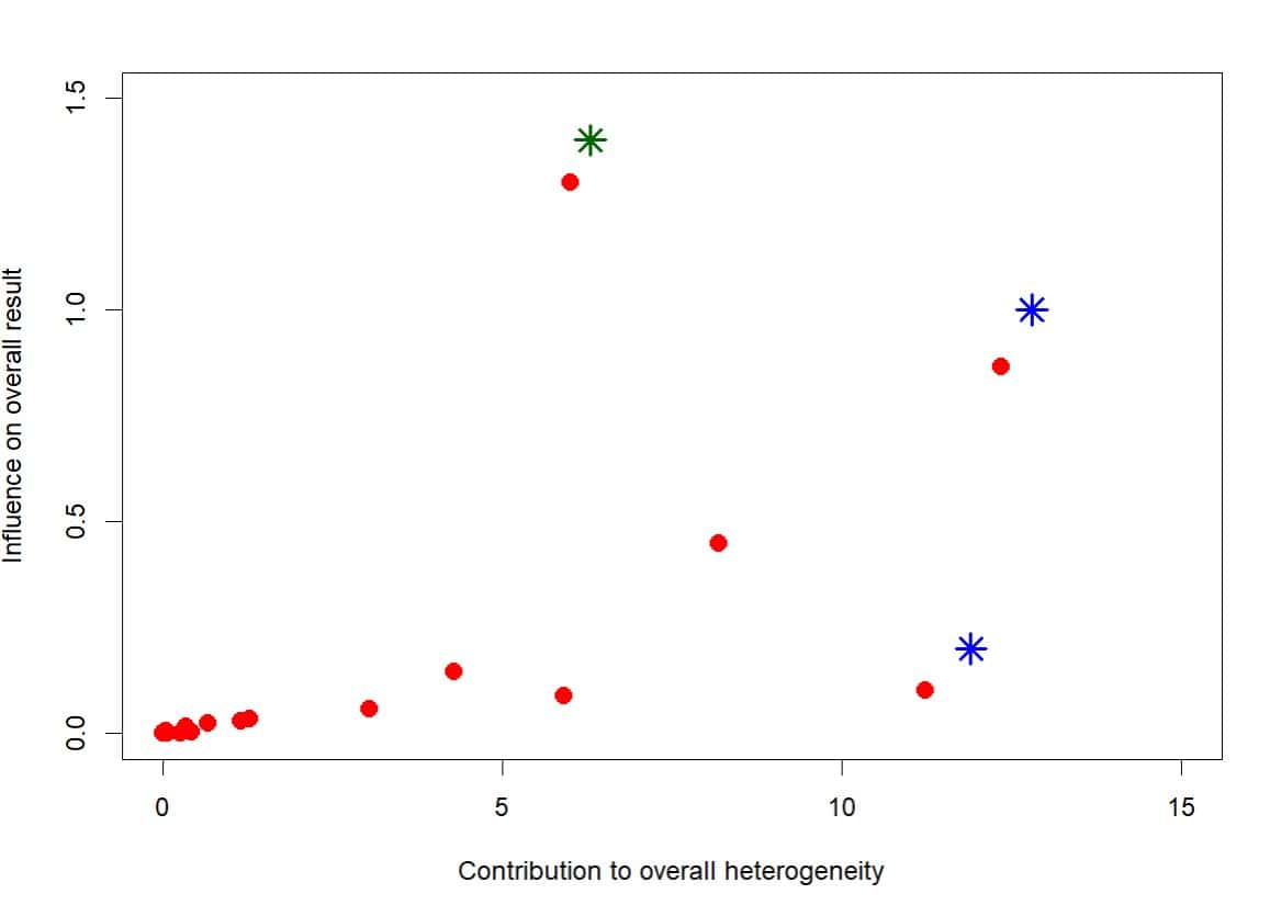
From this, we can also build a Baujat plot, a handy visual tool that helps us interpret each study’s contribution to overall heterogeneity (measured by Cochran’s Q) and to the global effect estimate. Take a look at the example figure to see it in action.

Most studies cluster together in one region. The further right along the X-axis, the more a study contributes to overall heterogeneity. Likewise, the higher it sits on the Y-axis, the more it influences the pooled effect estimate.
In this case, the two studies marked with blue asterisks stand out for their high contribution to heterogeneity. Meanwhile, the one with the green asterisk doesn’t rock the heterogeneity boat too much, but it clearly packs a punch when it comes to shifting the pooled effect.
Voilà, we’ve got three suspects. But as you can see, deciding where to draw the line (how far is too far) is a bit subjective. That’s where other, slightly more complex graphical methods can step in to help.
Another turn of the screw
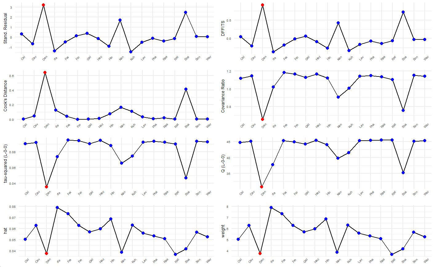
There are several graphical methods to diagnose how much each primary study influences the global effect estimate in a meta-analysis. Check out the second figure for a visual rundown. These plots rely on different metrics to tell us which studies play nicely with the rest… and which ones are the oddballs.
Let’s break down, in a very quick and dirty way, what each of these eight plots represents, moving left to right, top to bottom.

The first one shows the externally standardized residuals for each study: basically, the difference between each study’s estimate and the overall meta-analytic effect. They’re “externally standardized” because we recalculate the global effect without that study included. If a study fits well, its residual will be low. If not, high residuals suggest it might be influential or an outlier.
The second plot uses the DFFITS statistic, which tells us how much the overall effect changes when we remove a specific study, expressed in standard deviations. It’s calculated similarly to the standardized residuals, but takes into account the weight of the study in the random-effects model. High DFFITS values mean the study has a strong impact on the overall result and can be considered influential.
The third one? That’s Cook’s distance. It’s calculated in a similar way to DFFITS, but the difference in pooled effect (with and without the study) is squared, so values are always positive. The numbers may differ, but the patterns often look pretty similar.
Plot four shows the covariance ratio, that is, the variance of the global effect without the study, divided by the variance with all studies included. If the ratio is less than 1, kicking that study out makes your estimate more precise, which earns it a spot on the watchlist.
The fifth and sixth plots (third row) are easier to grasp. They show how much tau-squared and Cochran’s Q drop when each study is removed (the classic leave-one-out approach). A noticeable drop means the study is jacking up the heterogeneity.

Finally, the last row gives us the hat values and study weights. These are both ways of quantifying how much pull each study has on the global result. Once again, the ones with the most extreme values are the ones we need to keep an eye on.
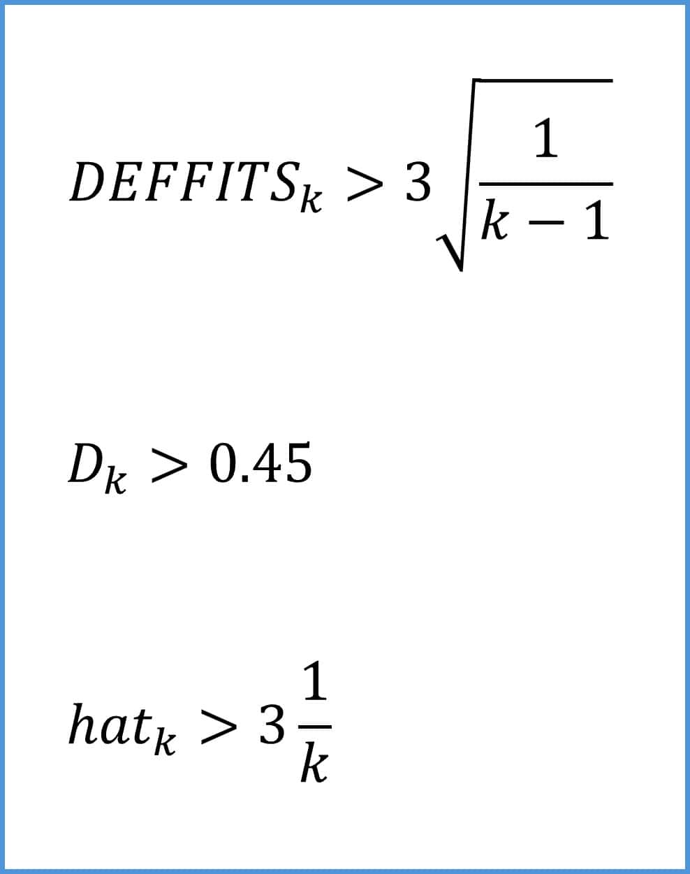
So yes, there’s a whole toolbox of metrics to help us figure out whether a study is an outlier or an influencer. As a rule of thumb, you can consider a study an influencer if it meets any of the three conditions shown in the attached figure.
We’re leaving…
And that’s where we’ll leave our deep dive into influencers. At least for today.
We’ve seen how both outlier and influential studies can drag around the pooled effect or crank up the overall heterogeneity in a meta-analysis, ultimately making the results less robust. That’s why it’s always worth checking whether these studies are in the mix and figuring out what kind of havoc they might be causing.
Just to clarify: a study can be both things. An influencer doesn’t have to be an outlier, but an outlier is often an influencer too.
Before we wrap up, two quick clarifications. First, when I mentioned rubbing salmon semen on your face at the start of this post, I wasn’t hallucinating. Believe it or not, it’s well on its way to becoming a trending topic.
Second, despite the chart overload I just hit you with, we didn’t cover every last one. You can, for instance, level up the leave-one-out strategy by plotting forest plots ordered by effect size or heterogeneity. The way those values are distributed can help you sniff out suspicious studies.
And then there are even more hardcore visual tools that’ll really put your computer to the test, like GOSH plots (Graphic Display of Heterogeneity), which explore heterogeneity by running the model on every possible study combination. If the results show clusters grouped by pooled effect and heterogeneity, it could mean you’re looking at multiple underlying populations and not one big happy study family. But that is another story…
