Boxplot.

The boxplot is widely used for its descriptive capabilities. It shows, in a simple way, the shape of a distribution.
You will agree that it is a curious name for a graph. When thinking of its name it pops into my head a picture of a shoebox with whiskers, but actually, I think this chart seems more like the tie fighter hunting ships from Star Wars.
Boxplot
In any case, the box and whiskers plot, whose formal name is the box plot, is used all too often in statistics due to its interesting descriptive abilities.
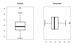
 To know what I mean, two box plots are represented in the first figure I attached. As you see, the graph can be represented in a vertical and horizontal way, and consist of a box with two segments (the whiskers).
Describing the vertical representation, perhaps the most common of both, the lower edge of the box represents the 25th percentile of the distribution or, what is the same, the first quartile. Meanwhile, the top edge (which corresponds to the right edge of the horizontal representation) represents the 75th percentile of the distribution or, what is the same, the third quartile. Thus, the amplitude of the box corresponds to the distance between the 25th and 75th percentiles, which is none other than the interquartile range. Finally, inside the box there is a line representing the median (or second quartile) of the distribution. Sometimes it can be a second line representing the mean, although it is not as usual.
Now, let’s go for the whiskers. The upper one stretches to the maximum value of the distribution, but it cannot go beyond 1.5 times the interquartile range. If there are higher values than the median plus 1.5 times the interquartile range, they are represented as points beyond the end of the upper whisker. These points are called outliers. We see in our example that there is an outlier which lies beyond the upper whisker. If no extreme values or outliers, the maximum of the distribution is marked by the end of the upper whisker. If so, the maximum is the most distant outlier from the box.
Moreover, all this applies to the lower whisker, which extends to the minimum value when no outliers or until the median minus 1.5 times the interquartile range when there are any outliers. In these cases, the minimum value is the farthest outlier from the box below the lower whisker.
Uses of boxplot
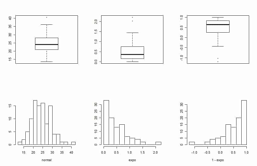
Then we can understand the usefulness of the box plot. At a glance we can obtain the median and interquartile range and intuit the symmetry of the distribution. It is easy to imagine how a distribution histogram will be seeing his box plot, as you can see in the second figure. The first graph corresponds to a symmetric distribution, close to a normal, as the median is centered in the box and the whiskers are roughly symmetrical.
Looking at the middle distribution, the median is shifted to the lower edge of the box and the top whisker is longer than the lower. This is because the distribution has the most data to the left and a long tail to the right, as seen in its histogram. With a similar reasoning, the third distribution is sifted to the left, and the longest whisker is the lower one.
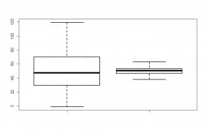
 Finally, this type of plot is also used to compare various distributions. In the third picture I attached you can see two seemingly normal distributions with similar median. If we are going to do a hypothesis testing on the equality of means, we need to know if their variances are equal (if there is homoscedasticity) to know what type of test to be used.
If we compare the two distributions, we see that the amplitude of the box and whisker is much higher in the first than the second, so we can conclude that the variance of the first distribution is much greater, so we cannot assume equal variances and we have to apply the appropriate adjustment.
Wer’re leaving…
And this is all I wanted to say about this box with whiskers, how useful is in descriptive statistics. Needless to say that although we used it to know about whether the distribution fits a normal or if the variances of several distributions are similar, there are specific tests to study these points mathematically. But that is another story…
