Precision enrichment ratio.

The procedure of choosing the cut-off point for a diagnostic test is reviewed. To decide this threshold, which is influenced by the characteristics of the model and the clinical scenario in which it will be applied, we will take into account the sensitivity and precision of the test for each possible cut-off point. The precision enrichment ratio will be useful in cases with a large imbalance between the two diagnostic categories.
An error that we clinicians make more frequently than is desirable is to interpret the result of a diagnostic test as a definitive verdict: the patient is sick or healthy, right?
But today I’m going to tell you about a little secret from the world of medicine: real life is rarely so simple. When we deal with diagnostic tests, we are immersed in an intricate game of probabilities in which there is no clear dividing line. This is especially so when we have to choose the cut-off point for a test with a continuous result or, in the case of a test with a dichotomous result (positive or negative), when we have to choose the cut-off point in the model that provides us the probability that the patient is sick or not.
The problem in many cases is that, whatever point is chosen, we will not be able to take full advantage of all the qualities of the test. As in many other aspects of life, where we must make choices and sacrifices, in the world of diagnostic tests, choosing the perfect cut-off point becomes an art in itself in which, instead of seeking the definitive answer, we will find ourselves seeking the delicate balance between the precision and sensitivity of the test.
But let no one despair because of this very pessimistic introduction. There are tools that help us educate the art of resignation and allow us to choose, if not an ideal point, then the most appropriate for each situation. We are going to talk about one of these tools today. It is another of those resources that come from the world of data science and that has the dazzling name of precision to prevalence enrichment ratio.
Let’s see what this is all about.
Statement of the problem
To more easily show the problem of choosing the cut-off point, we are going to see a couple of examples in which we will develop a multiple logistic regression model to estimate the probability of disease based on the values of several independent variables that we can obtain from the patient.
Once the model has been developed, applied to each patient, it will provide us with the logarithm of the odds ratio that the patient presents the result defined as 1 in the binary dependent variable (0 = healthy, 1 = sick, the most common). From this result we can calculate the probability that she is sick or, in other words, that the value of the dependent variable is 1.
In practice, an isolated probability value is of little use, so we will have to choose a cut-off point above which we will consider the test result to be positive (sick) and below which we will consider it to be negative (healthy). Finally, this result, positive or negative, will be compared with that obtained with that of the reference or gold standard, which we assume tells us with certainty whether the patient is healthy or sick.
This comparison is made with the usual contingency table, which allows us to calculate parameters such as sensitivity (S), specificity (Se), predictive values and likelihood ratios. In general, we usually base ourselves primarily on two parameters to assess which is the appropriate cut-off point for our clinical scenario.
The first is the S, the proportion of patients in whom a positive result will be obtained with the test. The second is the precision of the test, which tells us what proportion of the positives are actually sick. This is what clinicians know better as positive predictive value (PPV).
The million-dollar question is, in each case, what probability cut-off point we choose. A quick answer, especially if we use a logistic regression model, would be to choose the one with the probability greater than or equal to 0.5 for the positive result and less than 0.5 for the negative result, which would be the “natural” cut-off point for the logistic function of the model. As is easy to imagine, this will work very rarely, generally when the disease prevalence is close to 0.5.
Another thing we can do is graphically represent the probabilities obtained in the two groups (healthy and sick according to the gold standard). In an ideal world, the two probability density curves would be more or less well differentiated, so we would go to the central valley where the values of the two curves are minimum. On the right would be the positive cases and, on the left, the negative ones.
But in our daily life, things are not usually so simple. Let’s look at a couple of examples to understand it better.
Practical example (relatively simple)
To illustrate the examples, I am going to use the freely available R program. If you want to reproduce the experiment as described in this post, you can download the script from this link.
For this first assumption, I am going to use the Pima.te data set, from the MASS package in R. It contains a record of 332 pregnant women over 21 years of age who are evaluated for a diagnosis of gestational diabetes according to the WHO criteria. In addition to the diagnosis of diabetes (yes/no), it contains information on the number of pregnancies, plasma glucose, systolic blood pressure, triceps fold, body mass index, history of diabetes and age.
In this data set there are 109 diabetics and 223 non-diabetics women, which represents a prevalence of gestational diabetes of 0.33.
In this case, we are going to develop a multiple logistic regression model with the diagnosis of diabetes (1 = yes, 0 = no) as the dependent variable and blood glucose and body mass index as independent variables. We are not going to ask ourselves if this is the best possible model, since it is not the topic of this post and, as we have described it, it serves us perfectly for what we want to show.
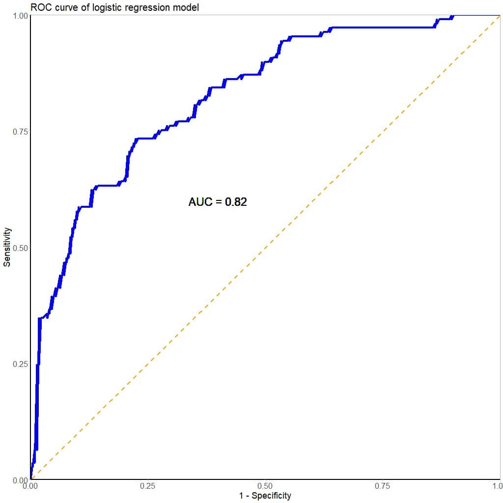
Before choosing a cut-off point to consider the test result (the model) as positive or negative, we can estimate its overall performance by calculating the area under the ROC curve (AUC), which you can see in the attached figure. Our calculation tells us that the test has an AUC = 0.82, which suggests that it performs well in discriminating between positive and negative results.
Now we have to choose the cut-off point for the test. To do this, we begin by graphically representing the density functions of the probabilities that the model gives us for the two groups, as you can see in the next figure.
As often happens in real life, there is quite a bit of overlap between the two curves, so no cut-off point will perfectly separate the sick from the healthy.
We are going to begin to educate our art of resignstion by assessing, as a cut-off point, the one corresponding to the probability of 0.5, marked with the dashed red line.
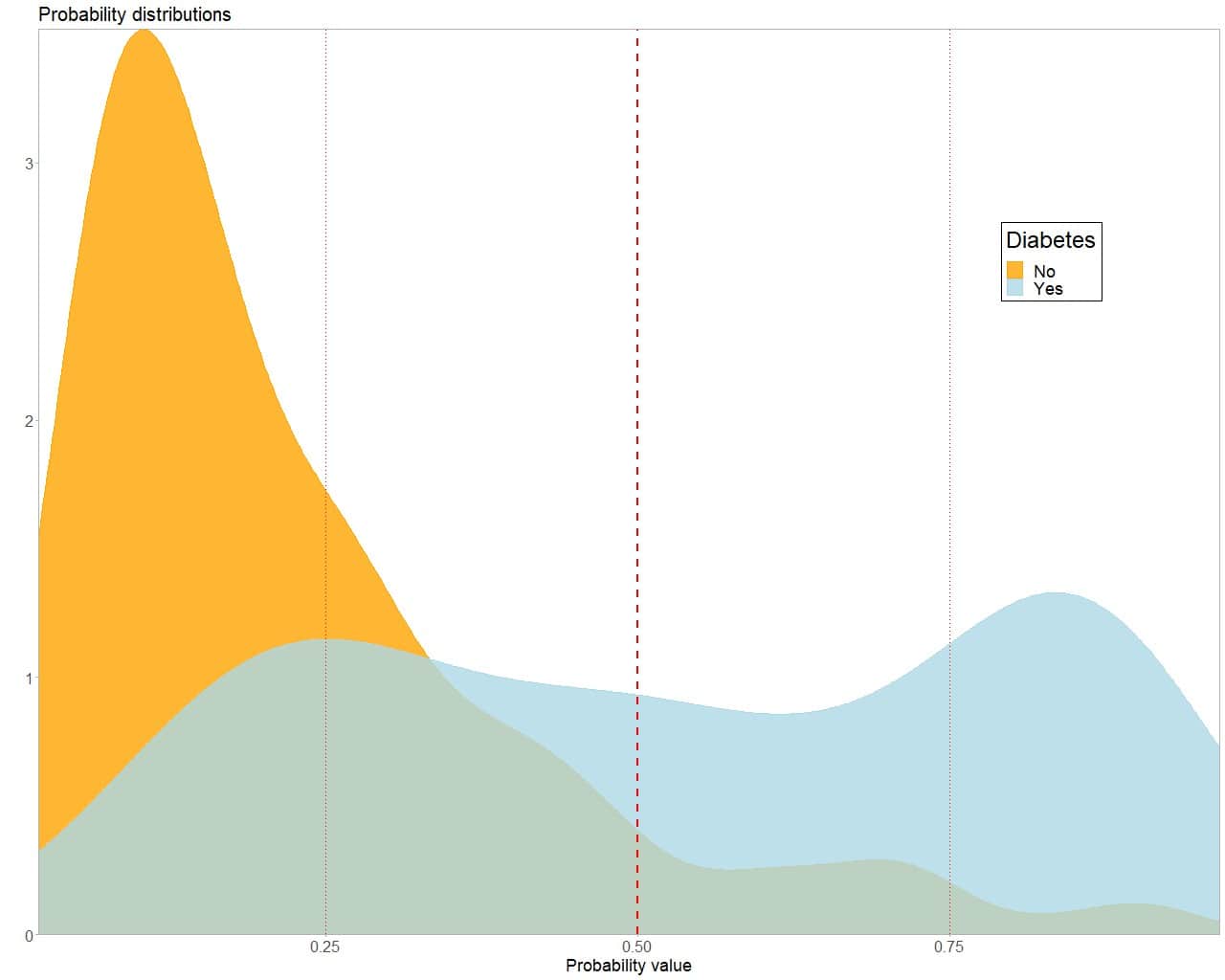
We can calculate that, for this cut-off point, S = 0.53 and Se = 0.91. The performance for non-diabetic pregnant women seems adequate, since only 20 of the 223 would be diagnosed as diabetic by mistake (false positives, FP). However, we would leave 73 diabetics undiagnosed, all those whose probability is to the left of the cut-off point.
How can we optimize this choice? If we go to the right, the Se and the PPV of the test will increase, but the S will decrease even more. At the cut-off point p = 0.75, we will have an S = 0.33, an Se = 0.98 and a PPV = 0.9.
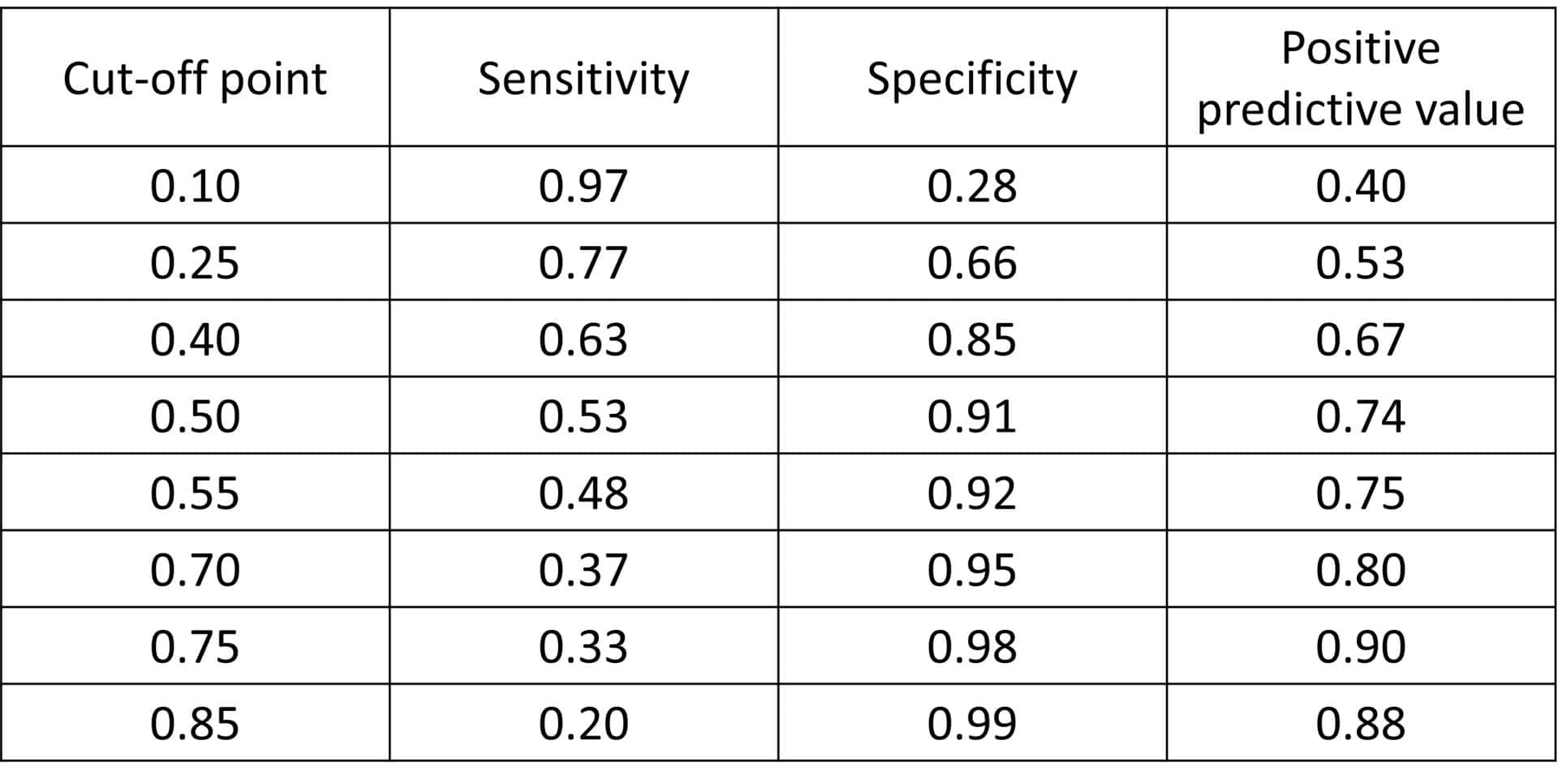
On the contrary, if we go to the left, the S will increase, but so will the FP as the Se and the PPV decrease. For p = 0.25, S = 0.77, Se = 0.66 and PPV = 0.53. You can see how these parameters change for different cut-off points in the first table.
We see, then, that it is not possible to have very good S and Se at the same time, we must prioritize one of the two. We will have to decide if we want to favour S (moving to the left of the curve) or the precision of the test, reflected by its Se and its PPV (moving to the right). In any case, in this example we would not have to make an excessive renunciation, since there is not great variation between the indicators, unless we go to the extremes of the probability values generated by the diagnostic model.
Considering the clinical context, we will probably choose to prioritize sensitivity more than precision. Surely, we would prefer that the smallest possible number of diabetic pregnant women remain undiagnosed. The price that will have to be paid will be a greater number of false positives, but which we will be able to correctly diagnose later with another relatively simple test, such as a glucose overload test. In my opinion, a good cut-off point for this model would be between 0.2 and 0.3.
Another practical example (somewhat more complex)
We are now going to look at another clinical scenario that is somewhat more complex to resolve. To do this, we resort to a data set that I have just invented and that includes the results of a fictitious study for the diagnosis of that terrible disease that is fildulastrosis. You can download the data at this link.
This is a registry of 10,000 patients who attend an emergency department and in which data is collected on the determination of some molecules that can help in the diagnosis of this disease, such as foolsterol, vitaminite, endorphinol, idiotin, stupidine and lipidosin. The record is completed by the diagnosis of fildulastrosis (0 = no, 1 = yes) according to the result of magnetic fildulastrine, the gold standard for this disease.
In this data set there are 473 patients with fildulastrosis, which represents a prevalence for the disease of 0.047, rounding up, 5%.
To begin to solve the problem, we developed a multiple logistic regression model with the diagnosis of fildulastrosis (1 = yes, 0 = no) as the dependent variable and the rest of the analytical determinations as independent variables.
As in the previous example, we are not going to ask ourselves if this is the best possible model, it is not the topic that concerns us today.
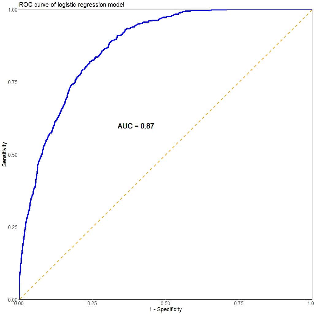
Also as in the previous example, we will first look at the overall performance of the model (see figure). We see that it has an AUC = 0.87, which suggests that the test (the model) has a good ability to discriminate between healthy and sick people.
This is a good start, so we are quite encouraged. It seems that, once we have learned the procedure with the example of diabetic pregnant women, solving this scenario is going to be a piece of cake.
However, the euphoria quickly fades when we look at the probability density curves that the model provides for the two groups (next figure). What we see now is no longer simply an overlap of the two curves but is more like a superposition. How are we going to differentiate between healthy and sick?
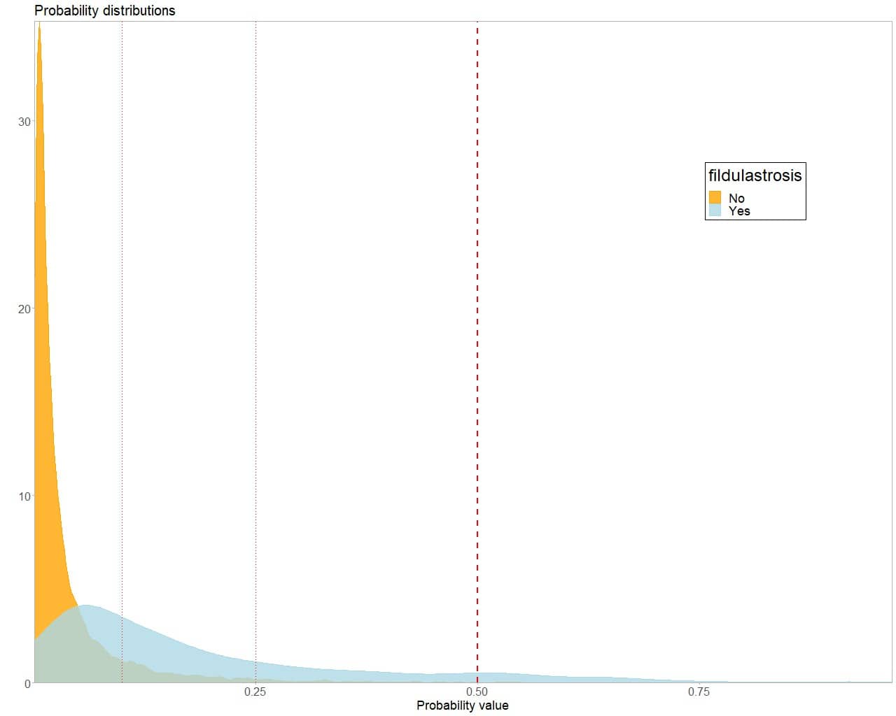
In this scenario it makes little sense to choose the cut-off point p = 0.5. We would have a very high Se, with very few false positives, but the S would be too low, 0.09, which would leave 400 of the 473 patients undiagnosed. In a word: disastrous.
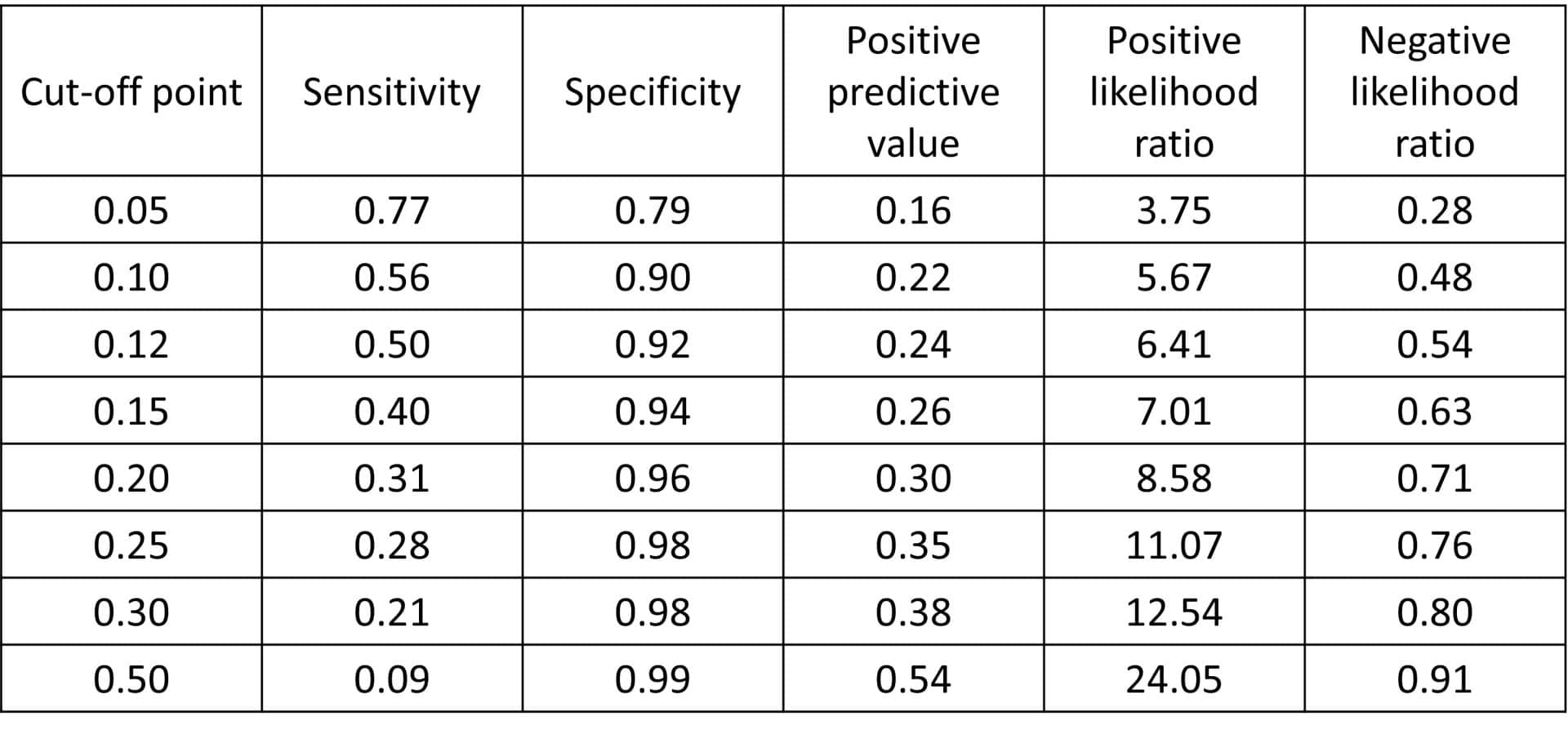
We have no choice but to move, and quite a bit, towards the left side of the curve. You can see the performance of the test for different cut-off points in the attached table.
For p = 0.28, we obtain S = 0.25 and PPV = 0.35. We still left 352 patients undiagnosed, despite having 220 PF. In another word: another disaster (well, in two words).
Overcome by discouragement, we go as far as p = 0.05. Logically, the sensitivity has improved, 0.77, but the precision is still very low, with a PPV = 0.15. This implies about 2000 FP, in which we would have to rule out the disease by doing a magnetic fildulastrine, a tremendously expensive and annoying test for the patient.
What can we do? Is there any solution to this problem?
Well yes, there is. But this solution requires us to use two resources. The first, that we put into practice our art of resignation. The second, the use of another tool: the enrichment ratio.
Precision enrichment ratio
When we deal with diseases with low prevalence, we can often find ourselves in a situation similar to the present one. There is almost overlap of the density curves, which makes choosing a cut-off point extremely difficult.
In these cases, we can take advantage of the fact that the probability curve dies earlier in negatives than in positives. This means that, as we move to the right from the lowest extreme of probability, the model will identify subpopulations in which the risk of being sick is greater than in the global set of patients (it is logical, we see it by the increase in PPV).
We will not be able to use the test to classify healthy and sick with good sensitivity and precision, but we can identify subjects whose risk of being sick is higher than average. In this way, we will move to the right carefully observing how much the S decreases and how much the precision (the PPV) increases with respect to the prevalence of the disease. This ratio between PPV and prevalence is what is known as the enrichment ratio.
We can represent it graphically, as it appears in the next figure. In the bottom graph we observe the evolution of the values of S when increasing the probability threshold that we consider as the cut-off point. As we already know, the higher this probability threshold, the lower S the test will have.
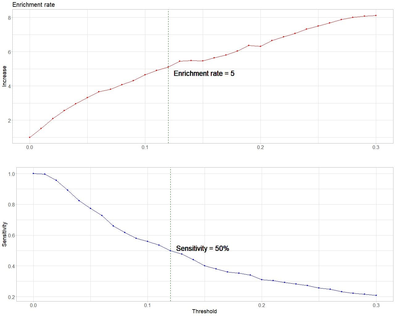
In the top graph we see how the enrichment ratio increases as we move to the right. This is logical, since this ratio is directly proportional to the precision of the test and, therefore, its PPV.
Finally, we can draw a line at the point at which we consider that we cannot lose any more sensitivity and that, at the same time, allows us to detect individuals with a risk a number of times greater than the average that seems appropriate to our scenario.
In this fictional example, it seems correct to me to choose a threshold p = 0.12. I have already used the new tool. Now it’s time to exercise the art of resignation.
At this cutoff point I have a S = 0.5, which means I only diagnose half of the patients. The rest will have to wait until they have more symptoms of illness so that we can try to rule it out by other means, which will surely be more expensive and annoying. In return, I detect a population with a risk of disease 5 times higher than the average, that is, with a probability of approximately 0.25 of being sick. In these we will have to determine magnetic fildulastrine, which will only be positive in one in four of them.
A final analysis
I suppose that, at this point, many of you are thinking that the test is worthless. Furthermore, some of you may wonder how such a useless test can have such good performance indicators. If you remember, the AUC = 0.87.
The problem is that the power of the test to diagnose or rule out the disease will depend on the cut-off point chosen. If you calculate the likelihood ratios for the cut-off point p = 0.12, the positive (PLR) is 6.25 and the negative (NLR) is 0.55, suggesting a modest power for the positive diagnosis and a zero contribution for the negative.
To achieve a PLR > 10 we would have to choose the cut-off at p = 0.28, but the S would decrease to 0.25. We couldn’t afford so many false negatives.
Regarding NLR, we cannot achieve a low value with any cut-off point. This test has a difficult time ruling out the disease. The cause is the imbalance of the two categories to be classified because the low prevalence of the disease. Keep in mind that if we say that all patients are healthy without doing any tests, we will be right by chance 95% of the time.
So, is it useful or not? Yes, I think so. Consider that you are on duty in an emergency department, and you want to know if the patients who come with a certain symptom suffer from this serious illness. You cannot measure fildulastrine in everyone, since it is very expensive and annoying and, at the end of the day, the vast majority (95%) will not suffer from the disease.
But it is not reasonable to do anything either, since the disease is very serious and we are interested in diagnosing it in its initial stages, if possible. Well, this test could help us to identify the group with a higher risk of disease, which we could follow in consultation, repeat the test after a while or perform the gold standard, as seems most appropriate.
We are leaving…
And here we have come for today.
I think it has become clear that the choice of the cut-off point for the positivity of a diagnostic test depends not only on the characteristics of the test, but also on the clinical scenario in which you want to apply it.
Furthermore, we have verified how this choice can become even more difficult when we deal with very low prevalences, situations in which statistical models have a harder time classifying healthy and sick people.
Finally, we have seen how the enrichment ratio, one of the tools that come from the field of data science, can help us in choosing the cut-off point in these more complex situations.
This is not the only tool we can use to resolve the delicate balance between a test’s sensitivity and its precision. There are others, such as the F-score, also originating in data science. But that’s another story…
